

.avif)


.webp)

.avif)
.avif)

.avif)


.avif)


.avif)

.png)


.avif)
.avif)


.avif)

.avif)
.avif)

.avif)
.avif)
.avif)

.avif)


.webp)
.avif)

.webp)


.webp)
.webp)


.avif)

.avif)


.avif)
.avif)


.avif)


_company_logo_2017.svg%2520(1)-p-500.avif)
.avif)

Navigating through a website should be easy. In this guide, we'll break down everything you need to know about website navigation and showcase some top examples to inspire your design.
What is Website Navigation?
Think of website navigation as the road signs that help visitors find their way around your site. It includes menus, links, buttons, and other elements that users interact with to explore different sections of your website. Good navigation design ensures that users can effortlessly discover content suitable for them.
Types of Website Navigation
- Top Navigation Bar: This is the most common type of navigation, usually located at the top of the webpage. It typically contains essential links to important pages like Home, About Us, Services, and Contact.
- Side Navigation: Side navigation is positioned vertically along the side of the webpage. It's often used for websites with a lot of content or complex structures, allowing users to easily access different sections.
- Footer Navigation: Footer navigation appears at the bottom of the webpage and includes links to secondary pages, legal information, and social media profiles.

.webp)
Top Examples and Why They Work
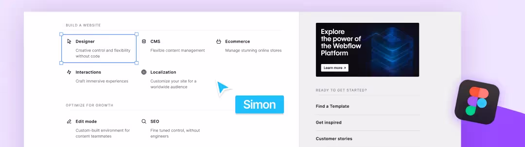
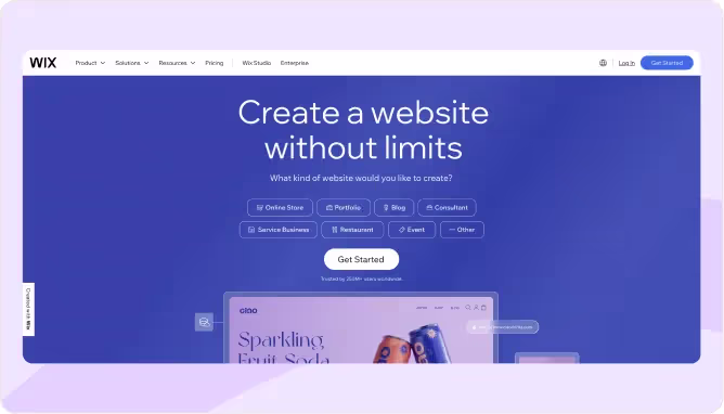
- Wix: Wix keeps it simple by displaying only a language icon to save space. While this may work for smaller websites or those with minimal navigation options, it's essential to ensure that crucial links are easily accessible.
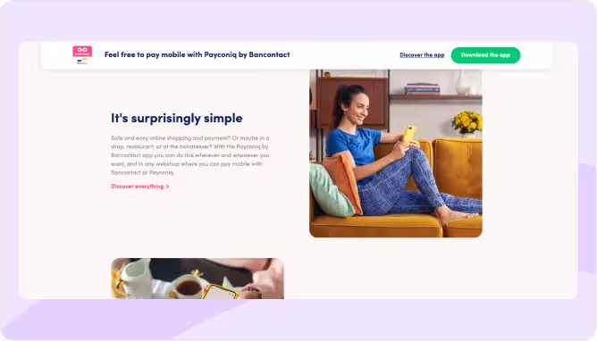
- Payconiq: Payconiq uses abbreviations for languages and implements a new navigation menu upon scrolling. This approach can be effective for websites that want to prioritize space or maintain a clean design.
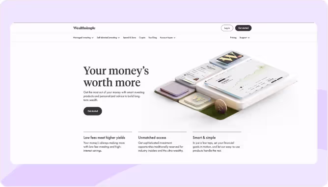
- Wealthsimple: Wealthsimple employs two different navigation bars, with one disappearing on scroll. This tactic can work well for websites that have a lot of content but want to keep the interface clutter-free.
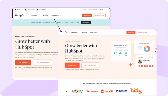
- Hubspot: Hubspot maintains a significant portion of the navigation bar while removing less important elements upon scrolling. This strategy is suitable for sites that want to strike a balance between accessibility and decluttering.
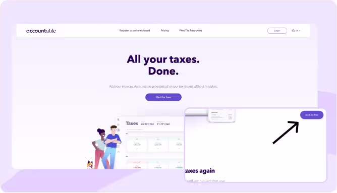
- Accountable: Accountable removes the navigation on scroll and replaces it with a subtly CTA in the corner, which may pose challenges with sub-navigation. This approach can work for minimalist designs, but might require careful planning for larger websites with more content.Note that it is not possible to easily search further within the website if you open the page on a resource such as a blog.
Conclusion: Designing for Conversion
Effective website navigation is key to enhancing user experience and ultimately driving conversions. By choosing the right navigation structure and elements, you can make it easier for visitors to find what they're looking for and take desired actions. Remember to prioritize clarity, simplicity, and the placement of compelling CTAs to maximize your website's conversion potential.
Ready to revamp your website navigation? Take inspiration from these examples and start crafting a user-friendly experience that leads to more conversions today!


